
My Role — Product Strategy, UX Design & Development
Sole product designer and developer responsible for product strategy, information architecture, interaction design, visual design, interactive prototyping, React Native implementation, device testing, and app store delivery across Android and iOS.
Project Overview
What it is
An independently designed and developed mobile application, taken from initial product concept through UX strategy, interaction design, React Native development, user testing, and publication on both Google Play and the Apple App Store.
Why I built it
Twenty years of designing and building digital products, eleven of them leading UX for enterprise healthcare software, and not one of them spent inside a developer console. Everything I had shipped lived on the web or behind a corporate login. I could talk about mobile design with some authority. I could not say I had ever answered a data safety declaration, chosen a content rating, or watched a release go from pending to live.
That is a specific gap, and reading about it does not close it. So I picked the smallest real product I could think of and took it the whole way myself: naming, brand, screens, build, testing, store listings, both platforms.
What I started with
Nothing but an annoyance. Every sleep-sound app I tried wanted an account, a subscription and a sleep score before it would make a noise. I wanted one that played a sound, ran a timer, and left me alone. No brief, no client, no deadline but my own.
What came out
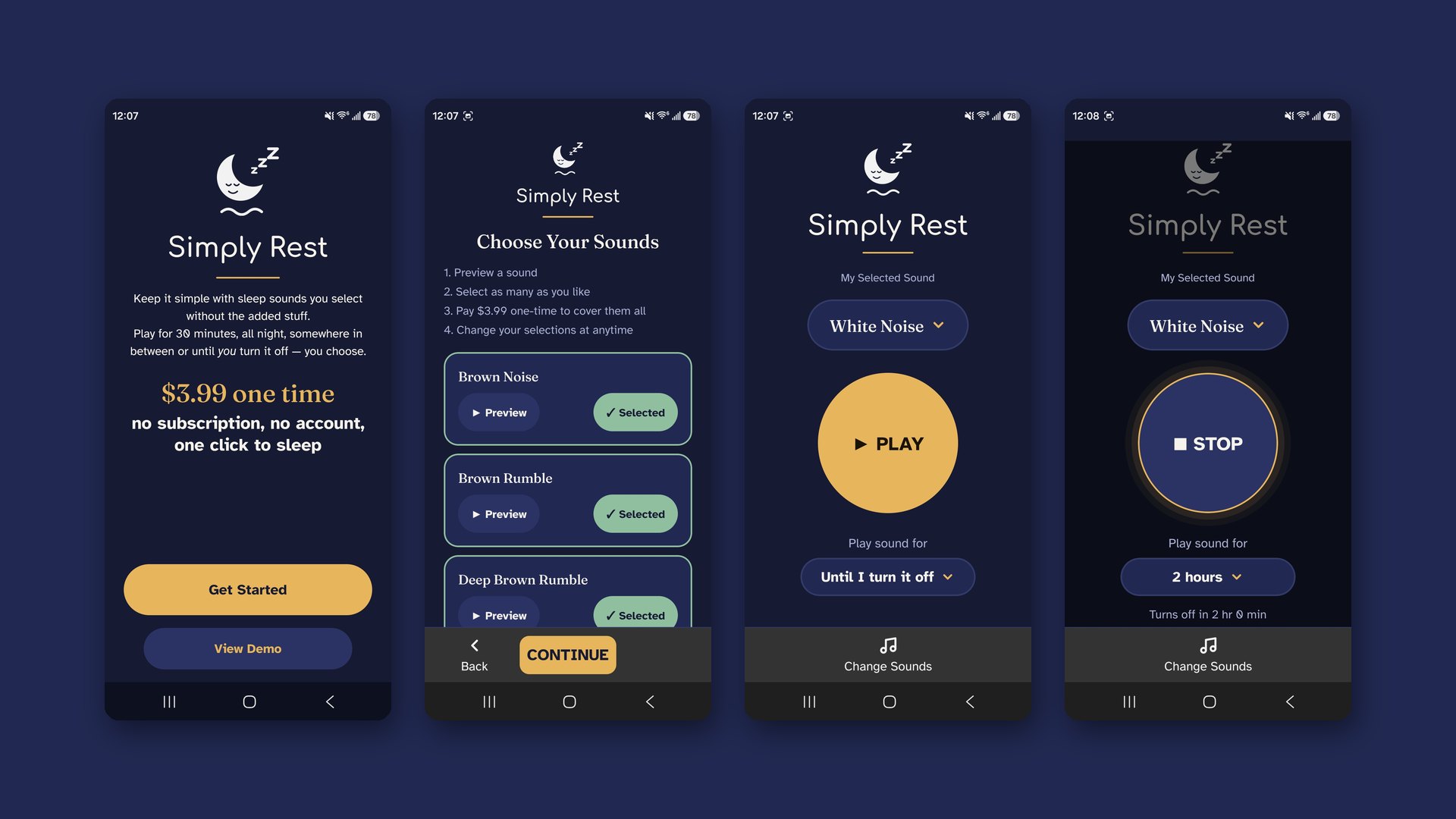
Simply Rest — five screens, one payment of $3.99, no account and no tracking — published on Google Play and on the Apple App Store. Built in React Native so one codebase serves both, tested on real devices by twelve people over a fourteen-day cycle, and shipped under my own developer accounts.
What this is not
It is not a commercial success story and I am not going to dress it up as one. It is a small app with modest numbers. What it is, is evidence — the kind that only exists if you have actually done the thing.
The Design Decisions That Mattered
Working without a stakeholder is a strange kind of freedom. Nobody is asking for a settings screen, and nobody is defending one either. Every feature had to argue for itself against a single test: could somebody operate this half asleep, in the dark, having never seen it before?
Five screens, and the restraint to stop there
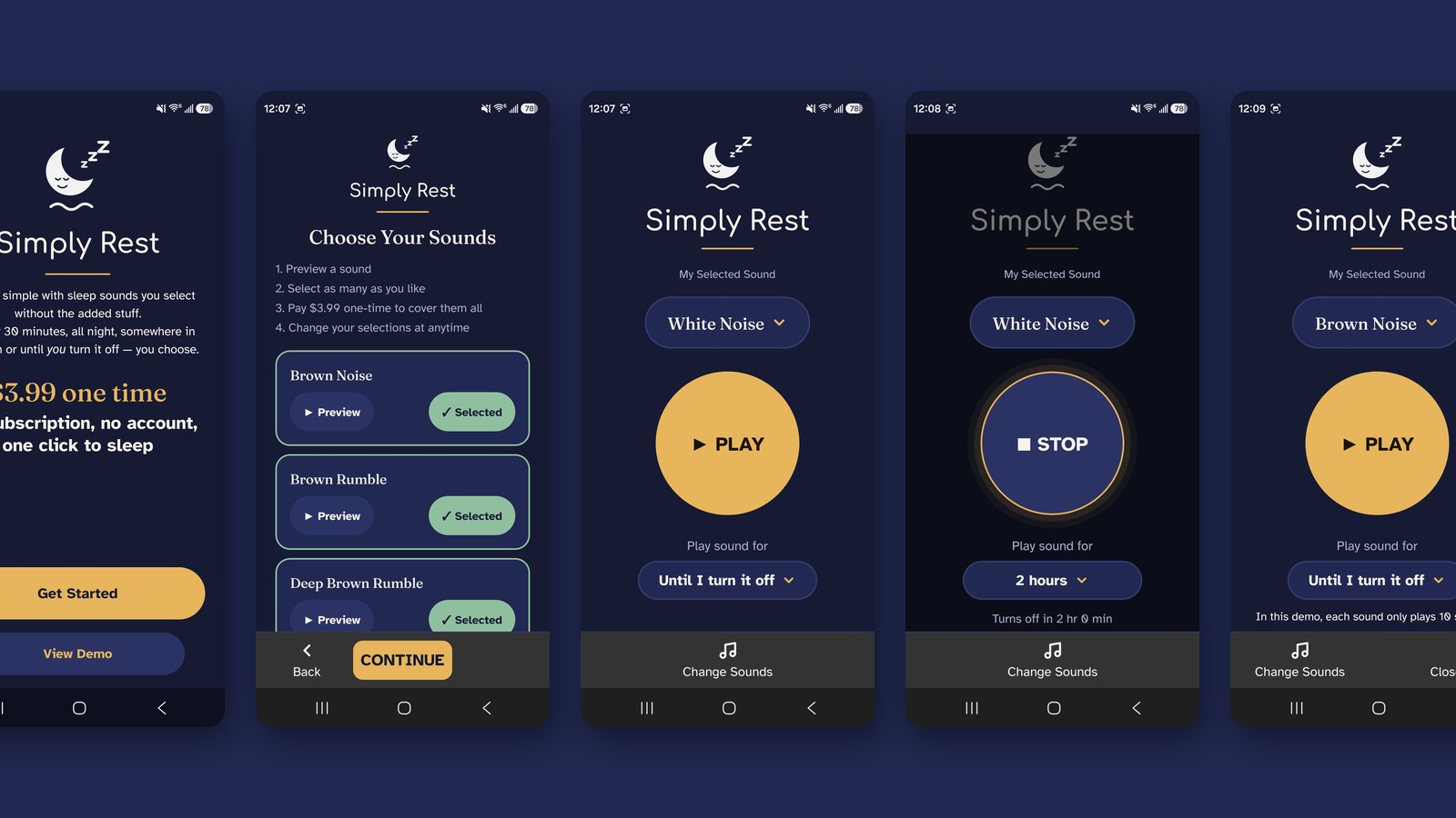
Welcome, choose sounds, play, purchase, demo. No onboarding carousel, no settings, no account creation, no profile. Each omission was a decision I had to make on purpose, because the default instinct in product design is to add. The hardest part of this project was not building features. It was declining to.
The interface dims when a sound is playing
The moment audio starts, the whole screen drops in brightness and contrast. This is the one design decision I am proudest of, and it came from the use case rather than from a pattern library: the person looking at this screen is trying to fall asleep. A bright interface at that moment is actively working against the product's purpose. The controls stay reachable; they stop demanding attention.
One payment, stated before you are asked for money
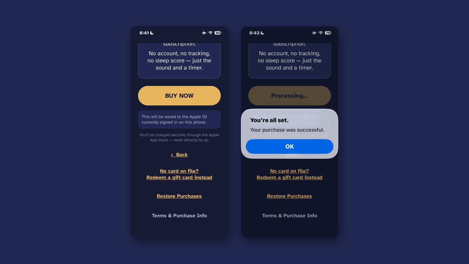
The purchase screen names the price, says the charge goes through the app store rather than through me, and tells you that every sound is yours afterwards with no further payment. That is a trust problem more than a conversion problem, and in a category built on subscriptions it is the whole proposition.
Designing for people who are not me
The target user skews older and less interested in apps than I am. That ruled out gesture-only interactions, small tap targets, and anything discoverable only by exploration. The play control is a large circle in the middle of the screen with the word PLAY on it, which is not a sophisticated design choice and is the correct one.
Both Platforms, One Codebase
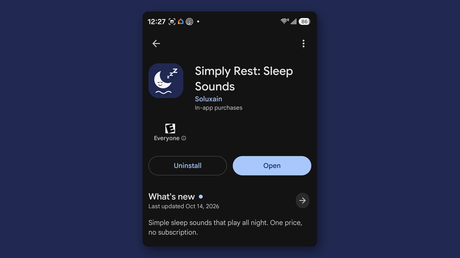
Built in React Native and shipped to Google Play and the Apple App Store. Click either image to view it full size.
What Shipping Actually Taught Me
The design work was the part I already knew how to do. Everything useful I learned happened after the screens looked right.
The timer that worked until the phone locked
The sleep timer passed every test I ran, because every test I ran had the screen on. The first time I used the app the way a real person would — start a sound, put the phone down, close my eyes — Android suspended the process and the audio stopped. Fixing it meant a native foreground service and a visible ongoing notification, which in turn meant a new permission, which in turn meant a separate declaration and a demo video for the Play Console.
One defect, three layers of consequence, none of them visible in a design file. I had read that mobile platforms behave differently in the background. Reading it and being caught by it are not the same education.
The store package is a project of its own
Feature graphic, icon at every required size, captioned screenshots taken from the shipping build, data safety answers, content rating questionnaire, category selection, health-app scope, privacy policy at a live URL. None of this appears in a portfolio and all of it has to be right before anyone can download anything. I now estimate mobile work differently than I did a year ago.
Twelve testers, fourteen days, and the feedback I did not expect
A closed testing cycle with twelve people on their own devices. The interface issues they raised were minor. The thing they kept returning to was the pricing — not whether $3.99 was too much, but whether it was really the only payment. Several asked twice. That sent me back to rewrite the purchase screen, and it is why the copy now says it three different ways.
Two platforms is not one job plus a little
One codebase got me most of the way. Store review, purchase handling, permission models, background audio behaviour and layout at the safe-area edges all differed enough to need separate attention. Anyone who tells you cross-platform means you do the work once has not taken something through both reviews.
Results & Lessons Learned
Real Results
- Idea to published listings on both stores — Google Play and the Apple App Store — under my own developer accounts
- One React Native codebase serving Android and iOS, built and maintained solo
- 5 screens, deliberately, with every omission argued for rather than overlooked
- 12 closed testers across a 14-day cycle on their own devices
- A real production defect found, diagnosed and fixed — background audio requiring a native foreground service, a new permission and a console declaration
- Every store requirement answered first-hand: data safety, content rating, category, health-app scope, privacy policy, permission justification
Why this belongs in a UX portfolio
Because the gap between a design that looks finished and a product that works on a stranger's phone is where most of the real decisions live, and you cannot see that gap from inside a design file. I came back to my day job with a sharper sense of what I am asking engineers for, better estimates on mobile work, and a working knowledge of two review processes I had previously only had opinions about.
It also answers a reasonable question an interviewer might have about someone whose last decade is enterprise software: can he still build the thing, not just specify it. The honest answer is in the stores, and anyone can go and look.